Flexdashboard is like a hidden gem which is mainly known for those people using R. In my opinion, it is a great visualization tool. You can substitute flexdashboard for those expensive commercial tools like Tableau and Power BI. Most importantly, it is totally free! You just need to know writing code in R.
Visualization plays an important role in business intelligence (BI) to help data analysts and decision-makers quickly get insights from data.
When it comes to the tooling of BI visualization, Tableau, Power BI, QlikView or even Excel are the favorite for most people working in analytic and reporting teams.These tools provide connection to difference source systems, offer features that can analyze and report data for streamlined presentation. Most of the time, you only need to know point and click, drag and drop. But don’t forget, you have to pay expensive licence and subscription fees.
Thanks to Vikram, my former boss, I was led further into the world of R. I have learned how to use those great packages, especially for data analysis and visualization. We together had built data visualization dashboards, interactive Shiny apps which got very positive feedback.
Flexdashbard enables you to use R Markdown to publish a group of related data visualizations as a dashboard, just like a Javascript-wizard would do.
Here are some of the merit points which I like to use it for BI visualization.
- It supports multiple tabs and rich sets of page layouts.
- It provides storyboard layouts for presenting sequences of visualizations and related commentary.
- We can combine data anlysis and manipulation with packages like dplyr, data.table.
- We can integrate it with any visualisation packages available in R, such as ggplot2, plotly, leaflet, etc.
- We can ship the whole dashboard as a single HTML file.
- We can parameterize, schedule and execute the dashboard in a fully automation way. I had ever run customer insight dashboards at the first day of every month.
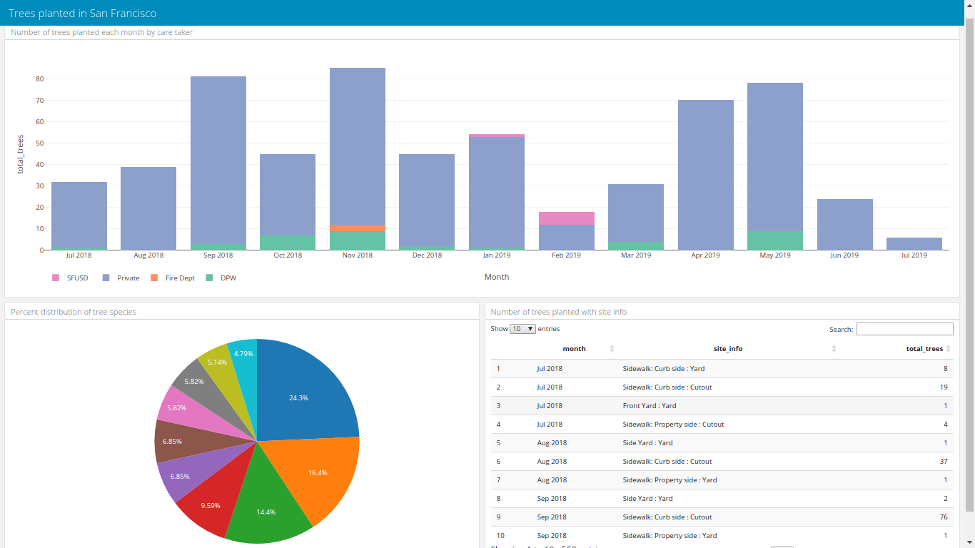
With less than 100 lines of code, I produce an interactive dashboard as shown below. (Credit to qwiklabs for the idea)

You can play with dashboard with this link. The code is here as well.